
Rebrand for non-profit organization dedicated to connecting areas in crisis with resources.
The Humanity Funds

Context
The Humanity Funds (THF) is a non profit organization that connects local groups in places of need with resources and networks. I worked as the product designer along with two visual designers to deliver a website redesign and visual identity rebrand.
Role:
Product Designer
Timeline:
Jan. 2023 - Mar. 2023
Process

Website Review
I analyzed the site for its the contents and navigation to get an understanding of what the organization represented.
Findings
Some of the tabs went to the same page
Fundraising is separated into different programs
Lack of transparency with the organization’s process
General inconsistent aesthetic design
The client also shared their brand ideals
Professional
Disciplined
Progressive
Dynamic

Competitive Audit
I spent time researching other humanitarian/philanthropic websites to better understand their function, purpose, and aesthetic — getting a better understanding too on visuals, architecture, and content.
User Objectives
Through my competitive audit, I gathered information for a user's wants and needs. I categorized those using the website into two main users:
New Visitors: coming to the site to learn more about mission/causes/projects and considering first-time donation
Donors: coming to site to understand impact of previous donation, considering addition donation
To satisfy the users’ wants and needs, the three objectives the site should achieve is to:
educate people on causes
collect donations from interested parties
share impact of organization w/ donors
Site Goals
Information Architecture
With the objectives in mind, the following is the sitemap of content and information architecture I believe would
guide a user through the process of education to donation
reflect ideals that the client hopes to evoke
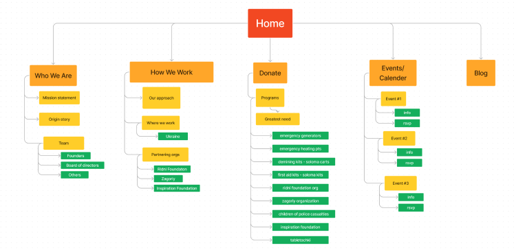
Who We Are: Highlight client’s knowledgeable backgrounds as well as their dedication and reverence for philanthropy
How We Work: Demonstrate ideals of accountability and dynamism by providing transparency of process and successes
Donate: Display active fundraising campaigns
Events/Calendar: Update community on upcoming events and receiving RSVPs
Blog: Allow donors to receive updates on the state of a previous project they’ve donated to, as well as inform new visitors of the company's accomplishments.
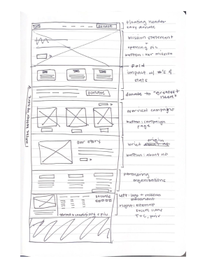
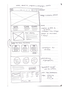
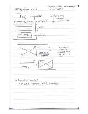
Sketching
After receiving feedback from the client on the initial sitemap, I began the process of prototyping by sketching out my ideas for various pages.
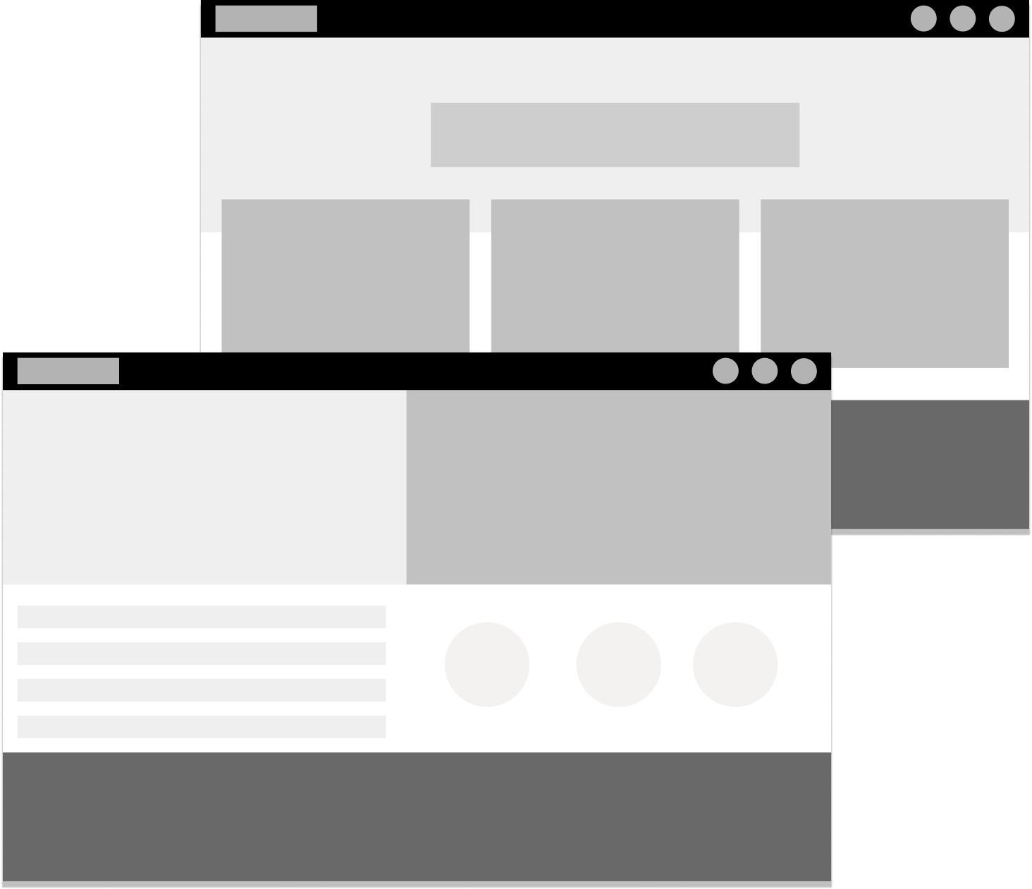
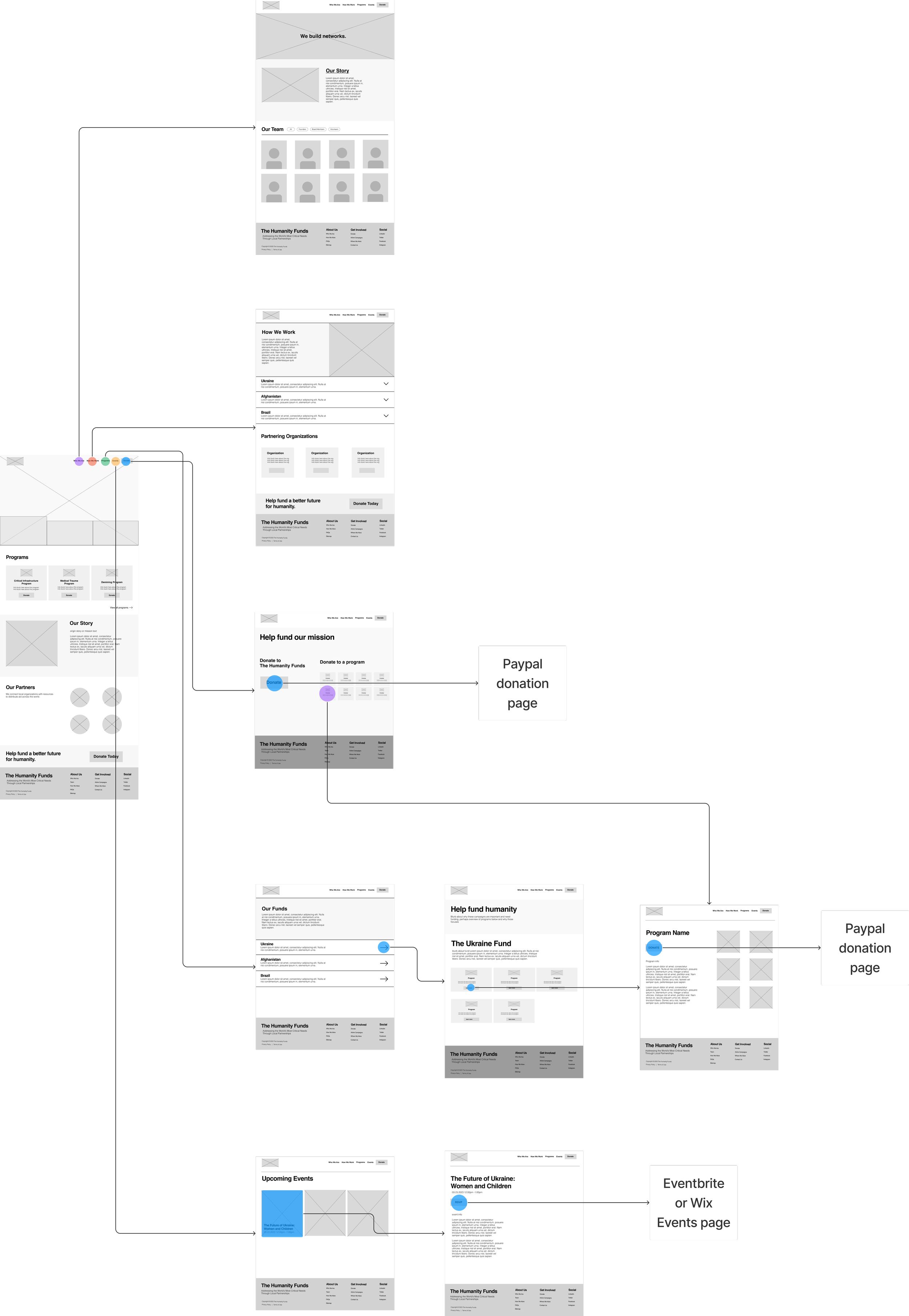
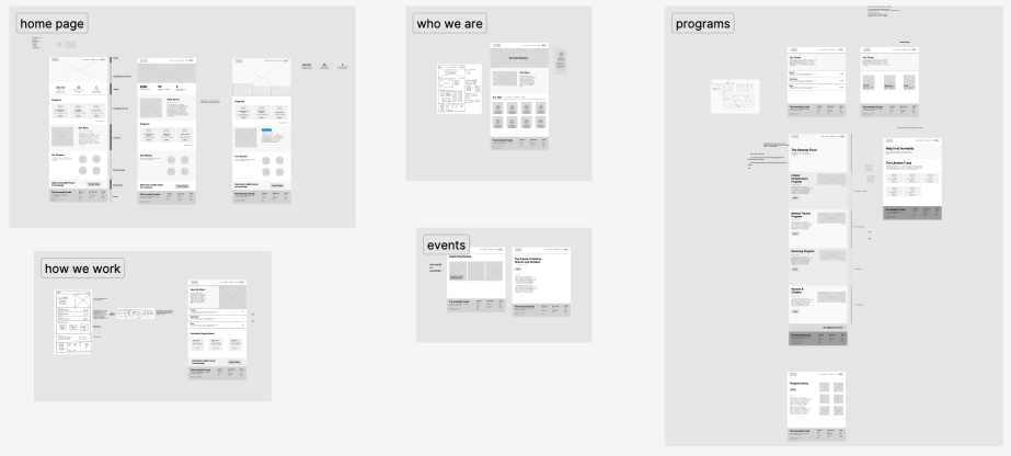
Wireframes
I made wireframes using FIgma for all the pages the site would have and organized them to make a user flow diagram.
Visual Identity
My teammates and the client worked to create the visual identity of the brand in tandem to my putting together the website structure and content.

Font
In collaboration with the client, they chose the in-between sans and serif humanist type IvyMode. To create contrast and balance, the base font is monospace font.

Color
To capture the organization’s important work, the slight white offers a soft human element in contrast to the stark black. A pure white also serves to highlight small details in the site. The site is separated into distinct funds to support various countries. The main color of each country’s flag as its motif throughout the site. The primary colors are to be used sparingly as to not give off a cheap feel.

Logotype
As traditional logos continue to see a decline in practice of design marketing, the visual design team came up with a logotype to be at the forefront of the brand identity.
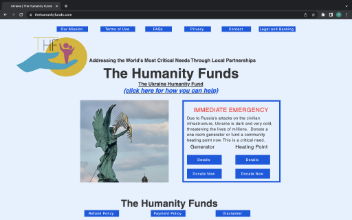
Prototype
Combining the visual and website structure, we made a medium to high fidelity Figma prototype as we still anticipated the client to provide us with additional copywriting and media. I worked on designing pages and making the prototype clickable.
User Testing
I conducted a brief usability study to determine the usability and desirability of our Figma prototype. The main element I was testing was the site navigation to ensure that the website provided a natural onboarding process for first-time visitors.
Participants were able to correctly navigate to the program details and donation page
Participants generally enjoyed aesthetics of the site
Participants appreciated that donation was separated into campaigns
Findings
Reflection
This project taught me that working with a client is all about communication and compromise. I learned how to effectively and concisely explain my work to non-designer stakeholders who might not understand why the UX process is fundamental to their product. I also gained a great deal of knowledge about typography and visual expression from my teammates who are both incredible creative talents. They thought about every curve and line of a letter, considering what the emotion each font expresses with meticulous attention to detail. I also had the opportunity to sharpen my visual design skills and better my Figma prototyping proficiency.