Usability study of a budget tracking app and exploration of financial literacy among young adults
Money Manager
Context
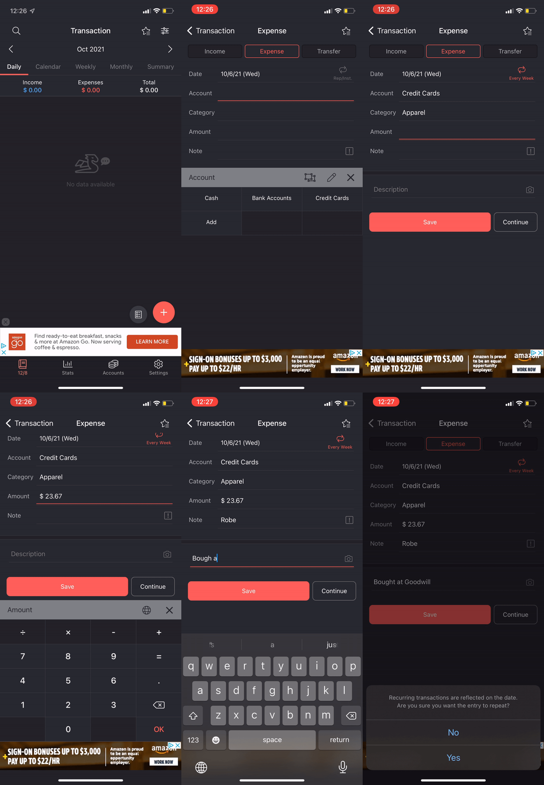
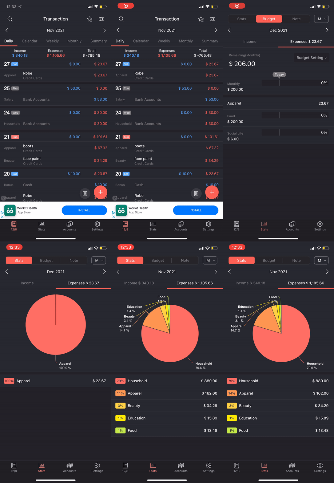
Money Manager Expense & Budgeting is a financial tracking mobile app with which users can record transactions, track income, view spending trends, and manage accounts. The app can serve as a helpful aid for those experienced with budgeting and expense tracking, or even as an educational tool for financial novices. I conducted a usability study to evaluate the effectiveness of the app as a tool for financial literacy in college-aged adults. My team consisted of two other Human-Centered Design & Engineering students.
Role:
UX Researcher
Timeline:
Sept. 2021 - Dec. 2021
Motivation
Financial literacy is an important aspect of leading a balanced, productive life. However, the results of a 2013 survey indicates college students possess a lack of knowledge and confidence in financial decisions (source). With the ever increasing digital literacy of young adults, money management mobile apps emerge as an effective, viable approach to address financial illiteracy in college-age adults.
Goals
The goals of our study were to evaluate the effectiveness of the app as a money management tool through its interface and features, identify user motivations for engagement and habits of use, and examine the intuitiveness of the interface.
Process
Interviews
To develop a baseline understanding of how young adults interact with their finances, we conducted 5 semi-structured interviews with first or second year college students. This criteria gave us insight to participants more likely to have recently moved away from home and began to achieve a level of financial independence.
Shift Into Adulthood
Self-sustenance weighed heavily on monthly budget
Focus on daily goals rather than long term
Improvement in financial fluency is a goal common
Financial Literacy
Ranged from diligent Excel sheet trackers to mental trackers
feelings of insecurity when managing money
limited financial literacy caused feelings of nervousness and of burden
Divergent App Desires and Goals
Goals directly reflected personal financial management style
Differing opinions on data granularity and notification frequency
All participants agreed that the interface should be simple, approachable, and engaging, all while giving the user as much agency as possible.
Insights
User Testing
We conducted 6 task-based testing sessions. I conducted two sessions and acted as note taker for the remaining. The tasks were created to test the apps features: ease of data entry, clarity of info visualizations , and navigation.
Data Collected
Time to completion
Taps
Scrolls
Errors/guidance needed
Responses to interview-style questions
Tasks
We conducted 6 task-based testing sessions. I conducted two sessions and acted as note taker for the remaining. The tasks were created with scenarios to test the apps features: ease of data entry, clarity of info visualizations , and navigation.
1. Expense Entries
“Enter 10 expense or income entries for October using given list”
Subtask 1.1: First expense entry
Subtask 1.2: Entries saturation point
Purpose: Understand cognitive load of manual logging
2. Visualizations
“Navigate to ‘Expense Pie Chart’ and make a financial decision using visualization”
Subtask 2.1: Navigate to pie chart
Subtask 2.2: Make decision using viz
Purpose: Test navigation pathways and effectiveness of visualization
3. Settings Navigation
“Navigate to two specified screens: ‘Budget Settings’ and ‘Repeat Settings.’”
Subtask 3.1: Navigate to “Budget Settings”
Subtask 3.2: Navigate to “Repeat Settings”
Purpose: Test intuitiveness of UI and multiple pathways
Data
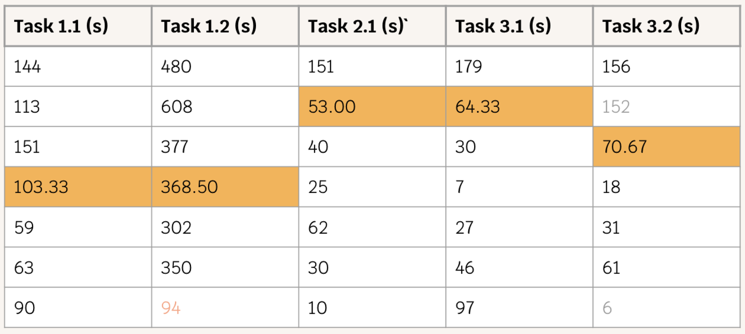
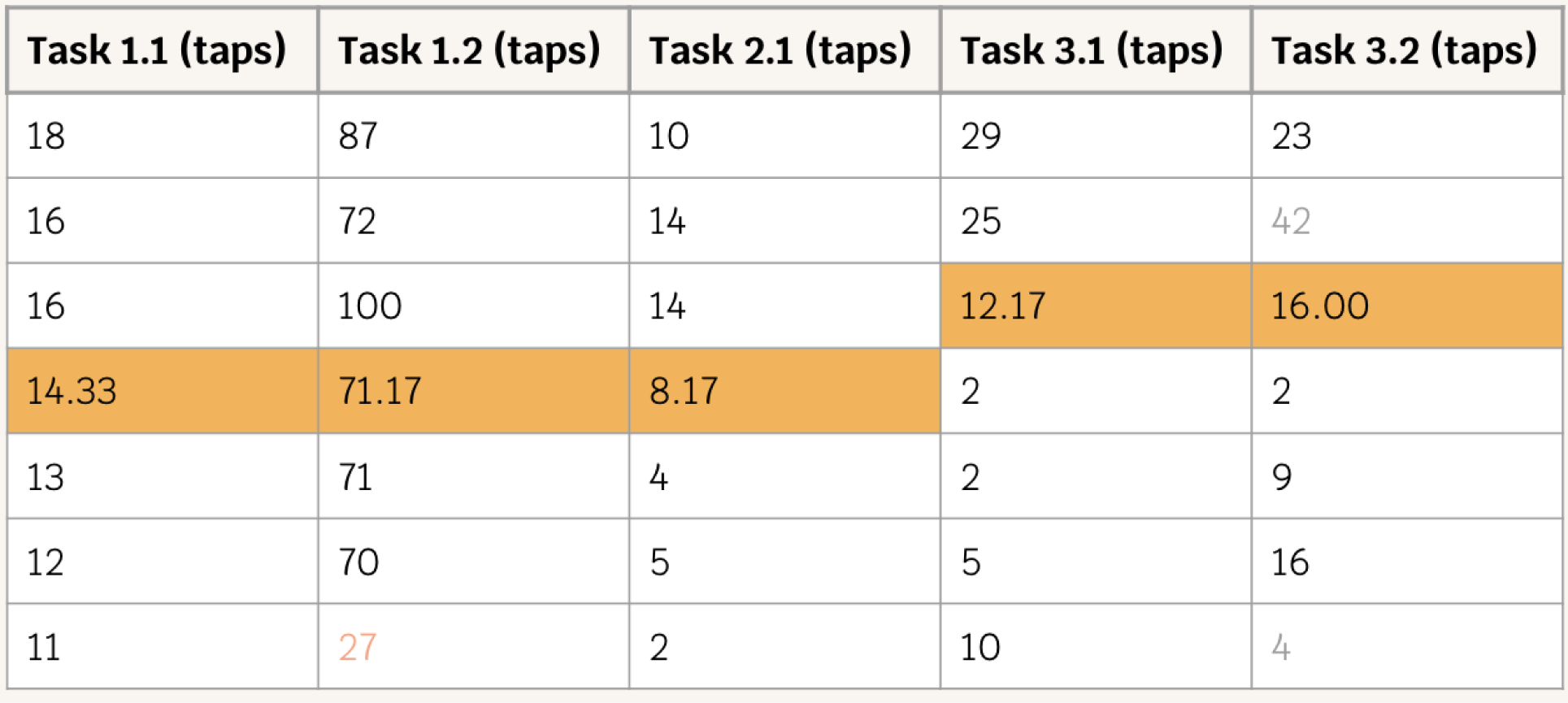
We organized our data into a tables with the orange cells representing the average. The following is some of our notable analysis.
Time Taken
Since the last 3 tasks were navigational, most of the participants were idling around, trying to figure out where to go, and this was reflected in their recorded time.
Taps
The same goes for the taps, a lot of them were fumbling around, familiarizing themselves with the app so we did account for idle scrolling. What surprised us was how the taps for Task 1.2 were significantly reduced and were not directly proportional to the entries. With this, we can say that the more a participant uses the app, the learning gap closes pretty quickly.
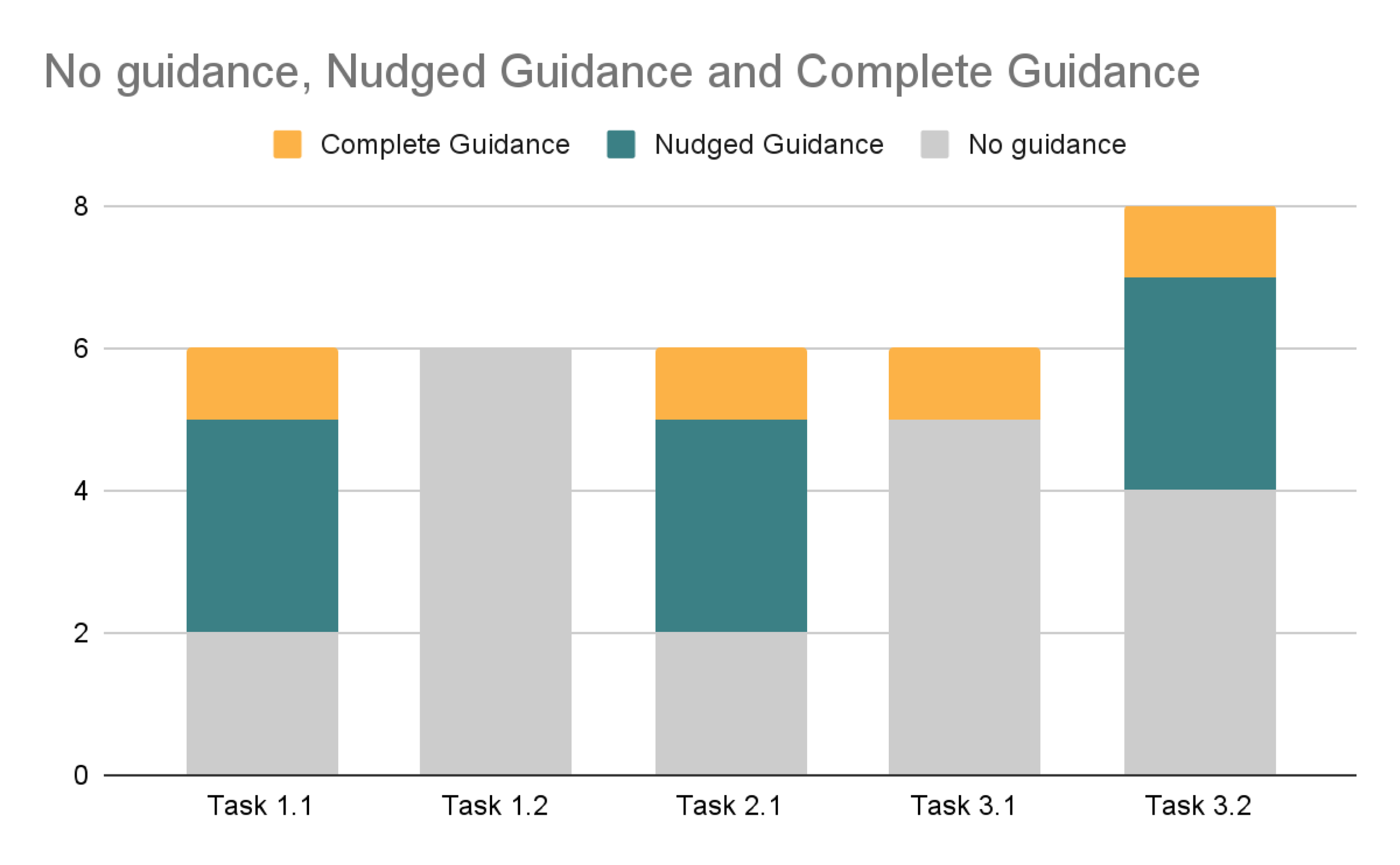
Guidance Counts
Guidance was given to almost every task. As the subtasks were grouped together allowing exploration of the same page, guidance was requested or given as participants arrived on the page for the first time. Interestingly, in the second subtask (Task 1.2), participants were able to execute the task independently. However, this trend was disrupted once again by the repeat settings task, where significant guidance was required for completion
Findings + Recommendations
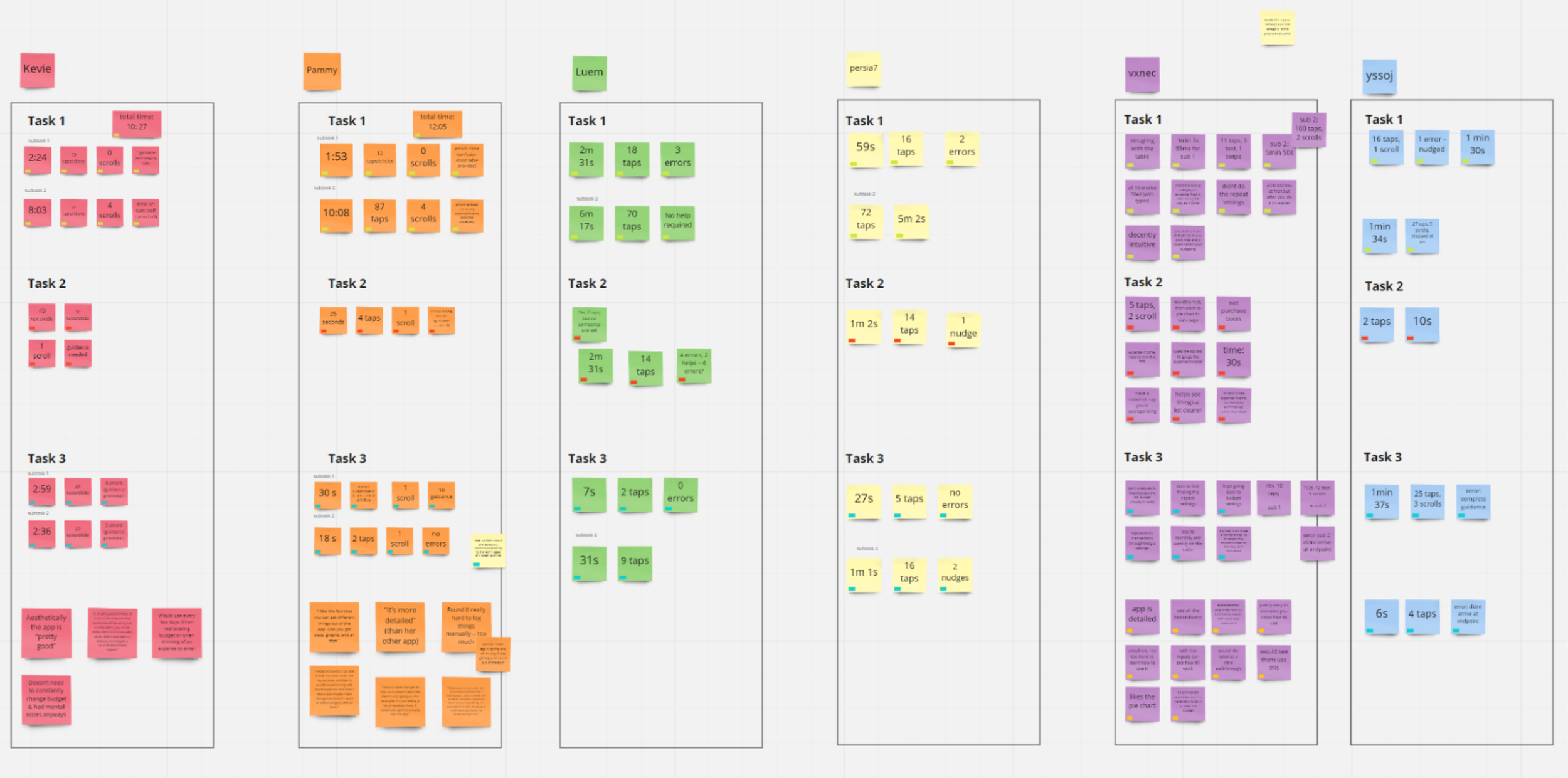
After analyzing the qualitative data, we also coded and affinity diagramed the responses to the interview-style questions throughout the session. The examination of the data produced three key findings: onboarding issues, high cognitive load of expense logging, and an adequate UI default. The findings and recommendations were ranked by impact on usability, feasibility, and addressability.
1. Onboarding Issues
Initial interaction with the app is too confusing for users. Guidance was required on all the tasks that required navigation to desired screens. The Money Manager app has a lot of features, buttons, and screens that are not familiar for a lot of users and does not provide instruction or explanation for its elements.
Recommendation: Guidance for first-time users
An initial intro video or walkthrough tutorial when the user first opens the app
Helpful pop-ups when encountering confusing screens or obscure buttons
Reduce the deep imbedding of important features
2. High Cognitive Load of Expense Logging
Every participant described the process of logging expenses as tedious, unnecessarily time consuming. The results of Task 1.1 bolster these claims, with an average completion time of 103.33 seconds, and an average number of taps of 14.33 to log a single expense. These values are high for the flagship feature and have drastic impacts on both short and long-term use habits.
Recommendation: Automated expense logging
Automated expense entry via connection to user bank accounts
Frequent entry autofill
3. Adequate UI Defaults
On a positive note, participants appreciated how simple the UI was without having excess elements on display. Default colors were coded nicely with the Income/Expense pair and were useful to look at a glance. The visualization, the strongest suite of the app, received a positive remarks.
However, during the data entry task, participants often failed to change the Income/Expense category for each expense—amounting to a significant errors in the budgeting process. The correct Income/Expense category should be displayed properly across the app to prevent such errors and support the account balance display.
Recommendation: Refine content heirarchy
Keep customization capabilities, but make them more accessible
Reduce the deep imbedding of important features
Reflection
This usability test was one that I had to conduct completely remotely. With that came communication and technological issues that we had to navigate for the first time such as participants with poor connection and grainy screen sharing. As a UX designer, I greatly strengthened my research and interviewing skills.
If I could iterate on this project, I would further explore adding educational elements to the app with the goal of improving personal financial fluency. I would also consider adding gamification to give users incentives to interact with the app.


